Posted by
Dan Passante on
Jul 5, 2023
Posted by
Dan Passante on
Jul 5, 2023
We all know what to do at a stop sign.
When someone gives you a thumbs up, you know they are trying to give you some positive feedback.
We all know the Nike “swoosh.” Without even seeing it, everyone reading this can picture it. You even know that it’s called a “swoosh.” Think about that. What is a swoosh?
There are signs that we all know. From the perspective of a business owner, why would you want your logo to be any different?
When a brand comes to us with video, animation and design needs, we will always look to use logos in our projects. Before you make a logo for your business, take the time to see the five types of logos that every brand needs, brought to you by the Aces at Studio A.
Your primary logo is very important, so don’t overthink it. What’s your story? How did you develop this brand?
Your primary logo needs to be an extension of you and your story. At Akullian Creative, Rich recognized this, and chose our logo with that story in mind. The colors of Akullian Creative are the same as the Armenian flag, the country Rich’s family emigrated from. Within the “A” of our logo, you can find “C” and “E,” spelling “ace,” because everyone in Studio A is an Ace, and it’s the acronym for Akullian Creative Enterprises.
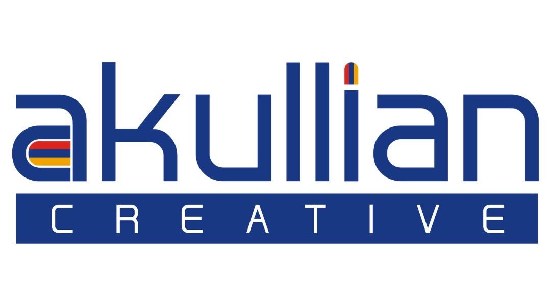
Our logo is clean and simple as a design. Sometimes your logo can offer a preview or hint as to what your company offers, but it doesn’t need to. Apple doesn’t sell apples and their logo is not a problem for them. As long as it’s a reflection of you, that is what really matters.
You’re going to be seeing this logo all the time, so make sure you like it before you put it on your website, stationary, ads, etc. Rebranding is a whole different ball game, and hopefully not one you’ll have to experience any time soon when you’re developing a logo from scratch.
Having an alternate logo is a good idea for a number of reasons, the first being practicality.
What if your logo is about to be featured on a website, but the colors of the background prevent anyone from being able to see it? Rather than plopping your logo into Photoshop or Canva and changing the color, you should already be prepared with alternate colors.
Your single color logo should be a reflection of your brand colors. Identify your primary color associated with your brand and make this your first single color logo. Making the logo now will save you time later and make you that much more prepared.
Here are the two single color logos we’ve put together for our brand that we use most frequently:
As a company that makes and deals with a lot of logos, we recommend having a black and white one. There are so many situations where you may need a black and white logo, one of the most important being the timeless look it gives a brand. Black and white will never go out of style, adding value in an industry that relies on remaining relevant. A black and white logo can be reproduced on anything: a piece of paper, drawstring bag, billboard, sticker, t-shirt, you name it. Black and white logos will always be easy to read and recognize, regardless of where they go, mainly because the focus is on the design and shape of the logo rather than the colors.
As if all this wasn’t convincing enough, black and white logos are often more cost-effective. If you’re not convinced you need one by now, it’s on you. Here is our black version:
An icon should be iconic, duh. Sometimes, these detailed and recognizable images associated with a brand are referred to as “iconic marks” for that exact reason: they should be emblematic of a brand. Icons should be smaller, less “wordy” and usable in situations like for a favicon: small logos that are used in URLs, displayed in website bookmarks, web addresses, etc. Icons are also popular for social media profile pics.
There’s a reason McDonald’s is referred to as the “Golden Arches,” it represents the brand well.
Before you make a long, horizontal logo, it’s good to know that this challenge will present itself at some point. Make sure to have an icon in place so that you don’t need to scramble and make another one that fits. When your business has its first mobile app, you will already be prepared.
For our brand, we prepared an iconic mark in our brand colors along with two single color versions:


A stacked logo is important to have, that being said, this is a great example of how every brand is different.
Technically, we don’t have a stacked logo. This is a smaller logo that is condensed by “stacking” a horizontal logo vertically to make it fit into a space. This space can be a profile picture, a business card, etc. Our icon is already condensed, so we don’t need a stacked logo. Every brand is different and there will be logos that your brand doesn’t make as well.
We may not have one, but we’ve made our fair share. Here are a few stacked logos we made for our clients:


When a brand’s logo doesn’t reflect what their services are, it makes sense to “expand” what the potential customer is seeing and include more information. Inspiration is everywhere: think about when the Starbucks logo has the word “coffee” on it, or when Applebees has “bar and grill” under their name. If you’re looking for expanded logos, you’ll come across countless examples of companies trying to get more meaning to their audience.
Take a look at two examples of expanded logos we’ve made for ourselves, one with our trademarked tagline We Tell Your Story ® and one with the services we offer:
Making things drastically better with a few small changes is a skill even the most experienced creatives are trying to master. Take this tip from us: you should think about how your logo is going to animate.
At the beginning of a video, sure, your logo could fade in. What if it started from the bottom of the screen, was written out, stayed still for a few seconds, then wiped away? The possibilities are endless…
Ask yourself these questions and prepare some notes for a designer. Envision how your logo is going to move on screen in an artistic way. Don’t be afraid to draw it out, there’s a reason you’re not a designer, so there’s no shame in attempting to show it on paper first.
Consider how fast it should appear on screen, what it will look like on a 16:9 (think wide-screen TV) and a 9:16 (think scrolling through your phone, a vertical screen) display, what colors it should be, etc. These small details will give a customer positive reactions to your brand. Once you have a creative vision, bring your notes to a designer and be ready to discuss how to make something you will like.
Here is an animation we made for our logo:

Here are a few logo animations we did for our clients:


This category is an honorable mention because of its application. If your logo is already a wordmark, then you should consider an abstract mark, which we’ll visit in a moment.
A wordmark is what it sounds like: the words of your brand spelled out… as words. Think Coca-Cola: without even putting those words into the font and color of their brand, you can picture their wordmark.
Early on, your goal is to establish positive feelings with customers. In other words, it’s going to take time before people recognize anything outside of your wordmark, and that’s fine.
For those of you that already have a wordmark as a logo, you should be focusing on an abstract mark. An abstract mark has fewer rules: it can be illustrated, based on the logo, include the name of your company, etc, there are many options.
For abstract marks, let’s go back to the Nike swoosh example again: that’s your goal. Getting people to recognize a “thing” as part of your brand is possible with the right strategy.
We recommend to size a logo with its largest dimension being 1920 pixels. This means if you designed a horizontal logo, make it 1920 px wide, if you designed a vertical one, make it 1920 px tall.
You want to save your various logo files in different formats, some of them being editable, such as a Photoshop (.psd) file, and some of them being ready-to-use, meaning they can be directly uploaded to your social account or website. Examples of ready-to-use formats are JPG and PNG files. To be prepared for any scenario, we recommend saving your logo variations as SVG, EPS, PDF, JPG and PNG files. SVG, EPS and PDF are all formats that can be edited with any vector graphic software, such as Adobe Illustrator.
A final tip is to leave some padding around the edges of your logos, especially your iconic mark, before saving them as JPG or PNG files. This will ensure that your logo will fit and look perfectly when it is being uploaded to your social accounts or your website.
For a more in-depth guide on logo design, sizes, file formats and more, we highly recommend LogosByNick’s The Complete Guide to Preparing Logo Files.
Creating a brand is hard work. Without touching on other big decisions like fonts or brand voice, there is a ton to think about just for the logo. Take things one step at a time and eventually it will all come together. Trust us, all the best brands thought of these things proactively, just like you’re doing now.
All of this info will eventually find its way into your brand guide, but that’s a blog for another day…
Follow Akullian Creative on Instagram and Facebook for more advice and tips from the Aces.